How does your web site look on a smartphone or tablet?
One in two Americans own a smartphone, and one in four own a tablet.* So while your customers view your web site on their desktop computer, more and more they're also seeing you on a new (and much smaller) device.
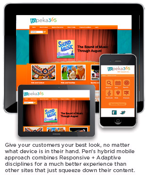
Make sure you look good, no matter how your site is viewed
If you haven't looked into a smartphone or tablet version of your web site - or if you have, and aren't satisfied - we can help. We've found most web site developers either just point to a different version of their current site, or simply scrunch existing content to fit a smaller device. Truthfully, neither is acceptable on its own, and only serves to confuse or frustrate your customers.
That's why we developed a different, hybrid mobile approach to web sites for smartphones and tablets. By combining both Adaptive and Responsive disciplines we enable you to provide a far better user experience, regardless of the device. So no matter what your customers have in their hands, you look great. And if you're really looking for a time-saving approach to manage multiple platforms, our proprietary Content Management System, FlipperSiteDeveloper®, lets you make one change that automatically changes all your sites.
Ready to get started on your new tablet and smartphone web sites? It's easier than you might think. Just give us a call at 316-651-0551, or send us an email . With a few initial questions we can get the ball rolling.